Mediwise
Mediwise is a mobile-first website aimed at improving user health outcomes by reminding users to take their medications, prevent double-dosing, and track health symptoms.

Role
Product Designer,
Researcher
Tools
Figma, Dovetail, ChatGPT
Timeline
January - April 2024
Skills
User Research, Sketching, Wireframing, Branding, Prototyping, Usability Testing
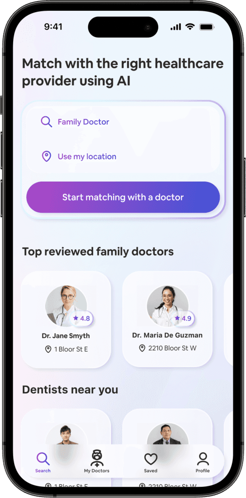
The process of finding the right doctor is a time-consuming and difficult process.
By taking a short assessment, the AI creates suitable matches to local doctors.
EMPATHIZE
A competitive analysis reveals there is inadequate information about doctors for users to make an informed and personalized decision.
Though competitors have filters for location, specialty, and availability, users still need to comb through reviews to discover compatibility.
Similar to Google Maps for healthcare providers. However:
It has a dated and cluttered design
Website only with no app
Shows clinics and not specific doctors
Primary search only relies on location and does not match based on users’ specific needs
The first doctor review website
with millions of doctors. However:
No online booking system
Review system isn’t verified
Only medical doctors can be searched
Primary search only relies on location and does not match based on users’ specific needs
Up-to-date, comprehensive, and offers many doctors. However:
Yellow colour scheme may not be accessible
Doctors' reviews are available, but users still need to comb through them to determine suitability
Primary search only relies on location and does not match based on users’ specific needs
User interviews were conducted with 5 participants with prior experience looking for healthcare providers.
The data gathered was organized using an affinity map. It revealed the time-consuming process of finding a doctor and the mixed experiences that resulted. Users are unable to make fully informed decisions when it comes to choosing a doctor.

INSIGHT: Users need a way to vet doctors to avoid the trial-and-error process when selecting one.
“If it's someone totally new then I'm not sure whether they're going to be good or not. And I don't really feel like being the guinea pig.” - TC

INSIGHT: Users want a consolidated source of information about doctors that can help them find and book appointments instead of combing through Google or manually calling clinics to find out more.
“I wish everything was just in one place essentially.” - MM

INSIGHT: Users need a trusted and professional relationship with their doctor.
“My old doctor would… joke around about my weight and insecurities whereas my new doctor kept it professional.” - KD

INSIGHT: Users want the least amount of friction as possible when accessing healthcare because they’re dealing with difficult and sensitive health conditions.
“A barrier of entry is how easy it is to access. And so I guess I was not in a good place. So desperate would be the word.” - DN
When asked what matters most, there were 3 themes that emerged.
67%
said doctor's care
They want a want a doctor who is compassionate, knowledgeable, and provides great service.
67%
said availability
They want a doctor who is taking new patients and has appointments in the near future.
50%
said location
They want a doctor who is located nearby and has accessible hassle-free parking.
DEFINE
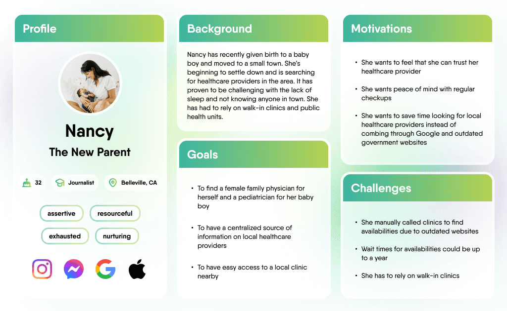
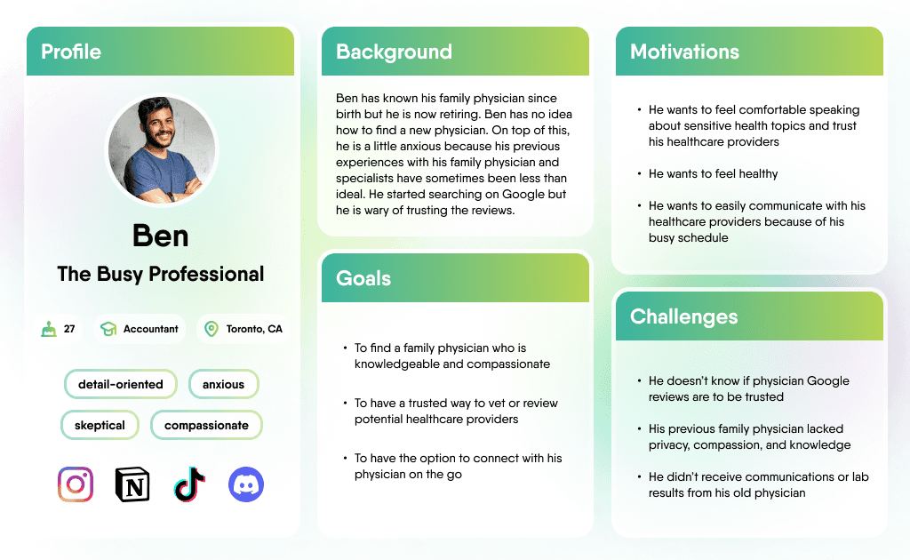
To help guide the decisions I made I created personas. Their common need between them is to find a trusted and vetted doctor with the least friction as possible.
How might we connect patients to healthcare providers that suit their specific needs?
IDEATE
First, considering the goals, motivations, and challenges of the personas, I generated as many potential solutions I could within a time constraint.
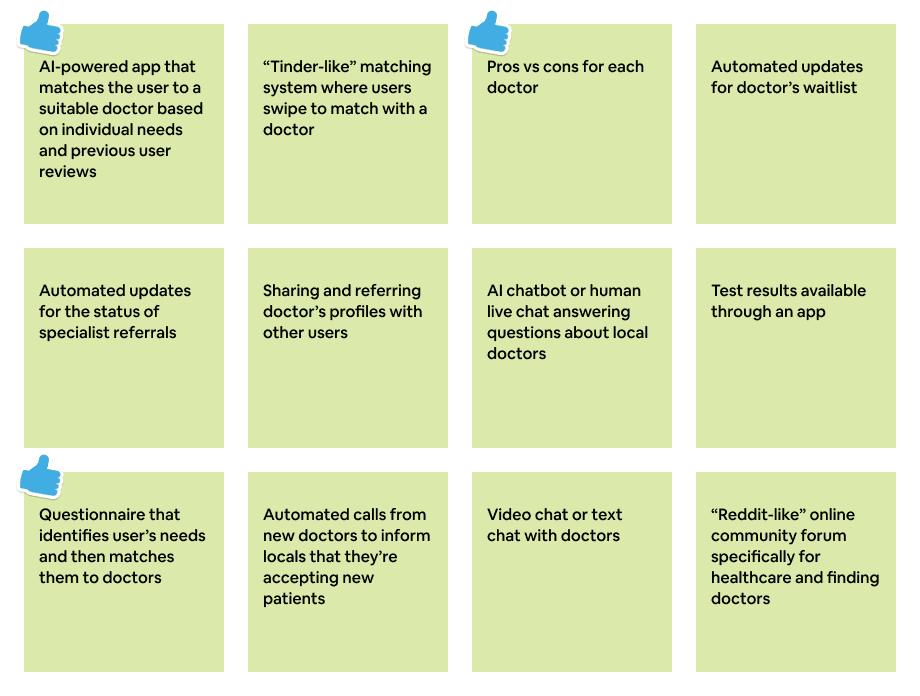
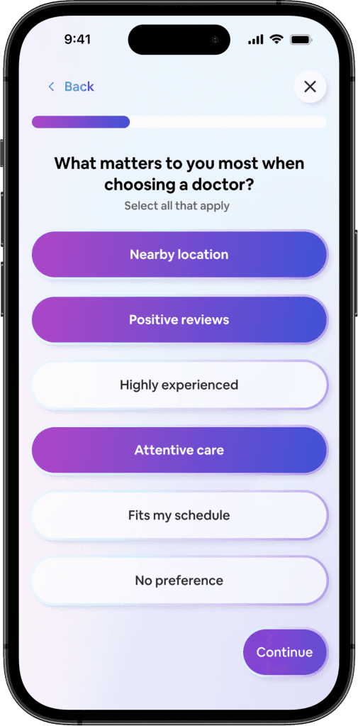
I settled on an AI-powered app that uses an assessment to identify the needs of the user and then matches them to suitable doctors.
An assessment provides a structured way to implement AI while still personalizing the match between user and doctor. The quick process cuts out all the time-consuming research for the personas.
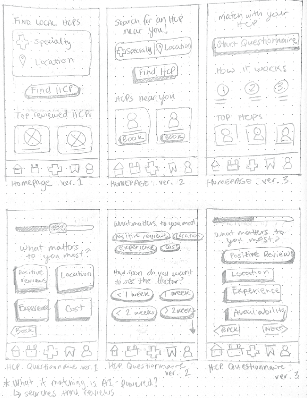
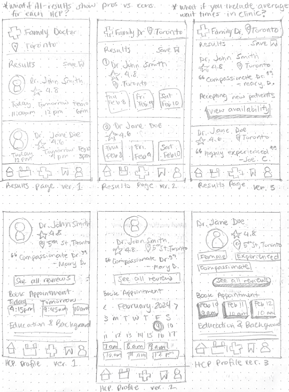
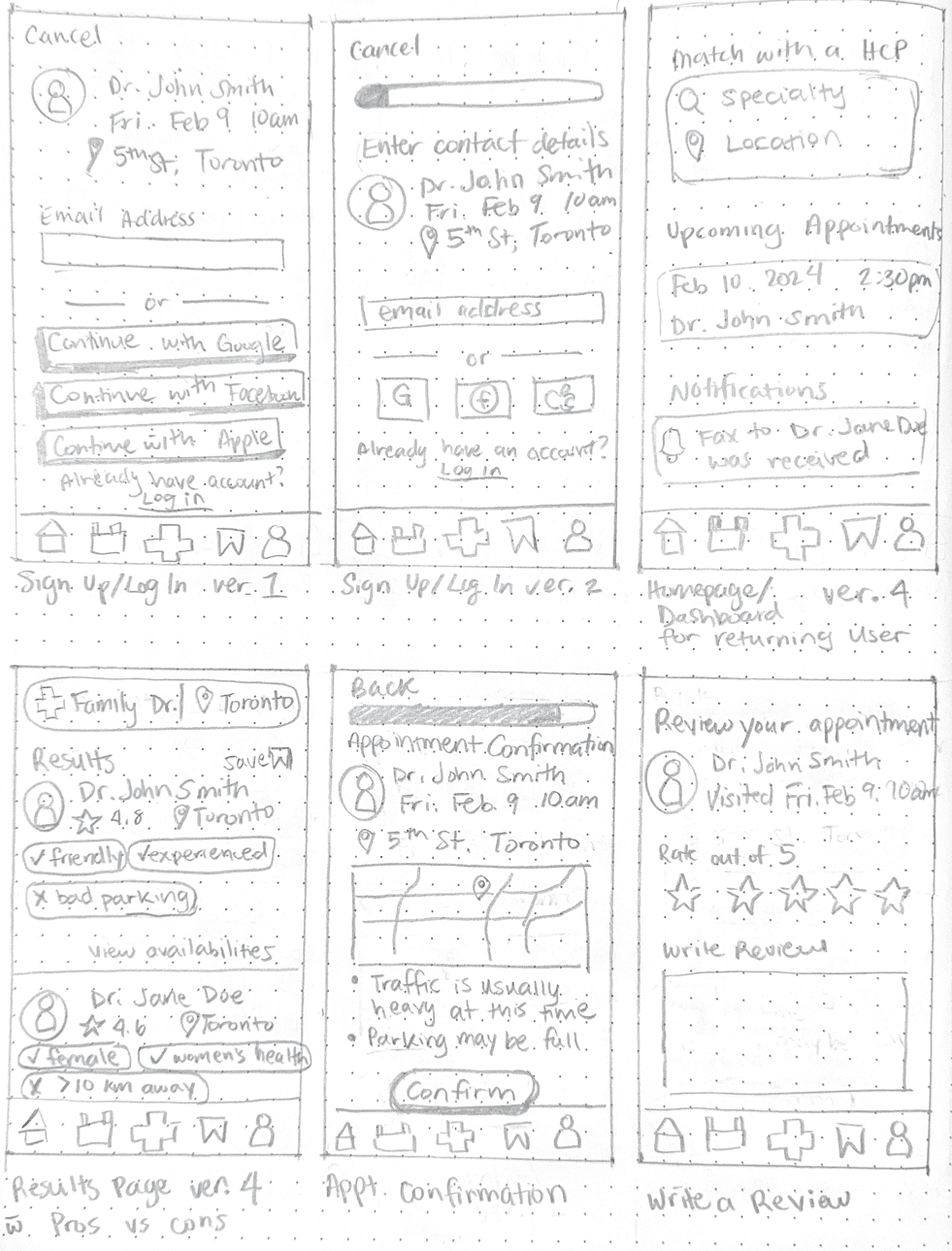
I first created an initial sitemap to imagine how the app would flow and how each screen was connected.
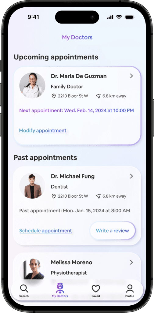
The homepage is the beginning of the matching process while the bottom navigation bar focused on the user's interactions with the doctors and saved searches.

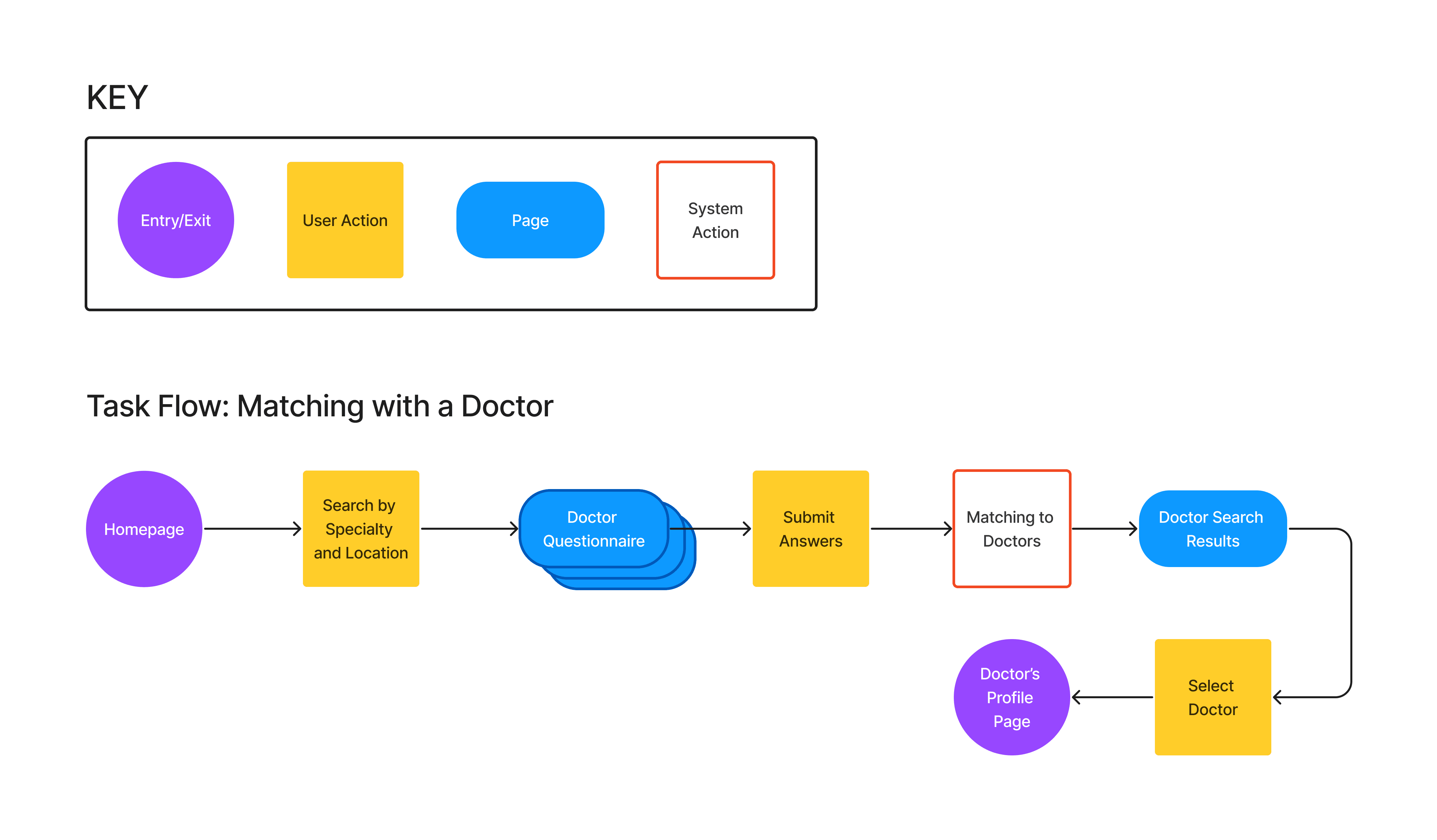
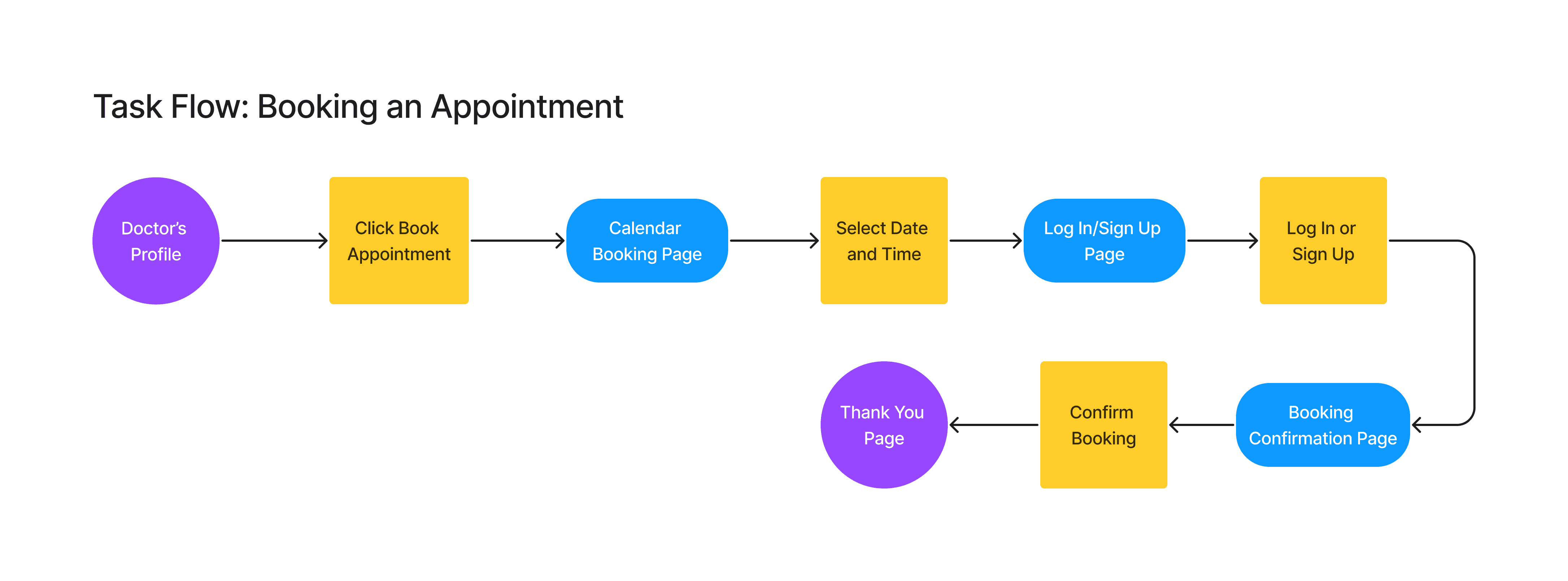
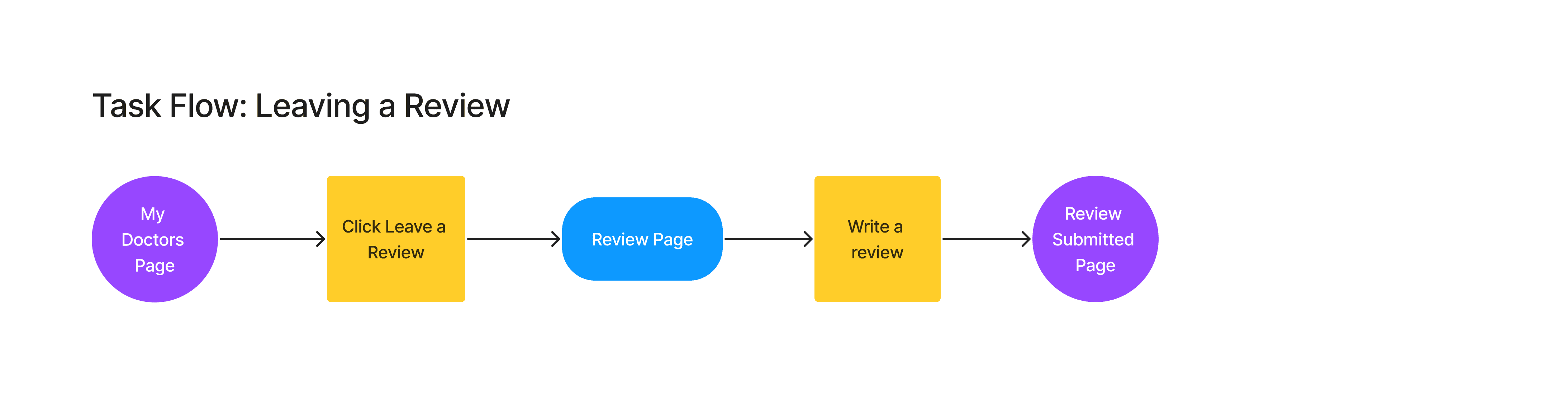
For a minimum viable product that addresses the goals and motivations of the personas, I determined the 3 main task flows below.
While the main function is to match with a doctor, users need need to book an appointment and also leave a review in order to inform future matches for the app to be useful.
Early low-fidelity sketches were used to explore potential ways in which the solution would function. The solution begins to take shape.
PROTOTYPE & TESTING
The selected wireframes were rendered into a working prototype for the first round of usability testing to gain feedback from participants and identify issues that they encounter before moving on to a high-fidelity prototype.
An initial round of usability testing was performed to validate the mid-fidelity prototype.
The data and errors made informed the key findings and recommended changes:
Increase the height of buttons and form fields to increase accuracy when users are tapping
Add drop down menus for the homepage search fields to give a more responsive experience
Make the pre-filled suggestion text gray inside search fields to invite the user to tap on the field, then have the text become a different colour when a choice has been selected or typed.
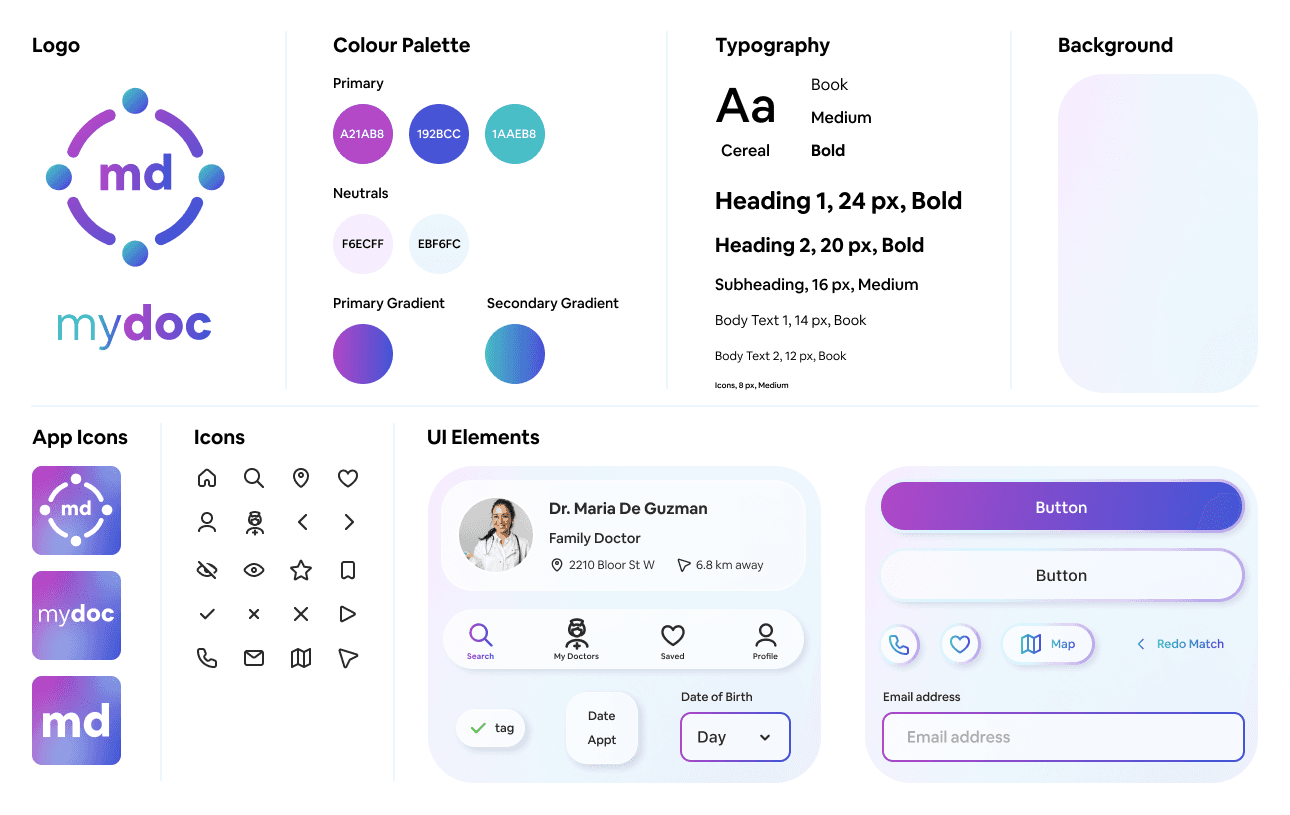
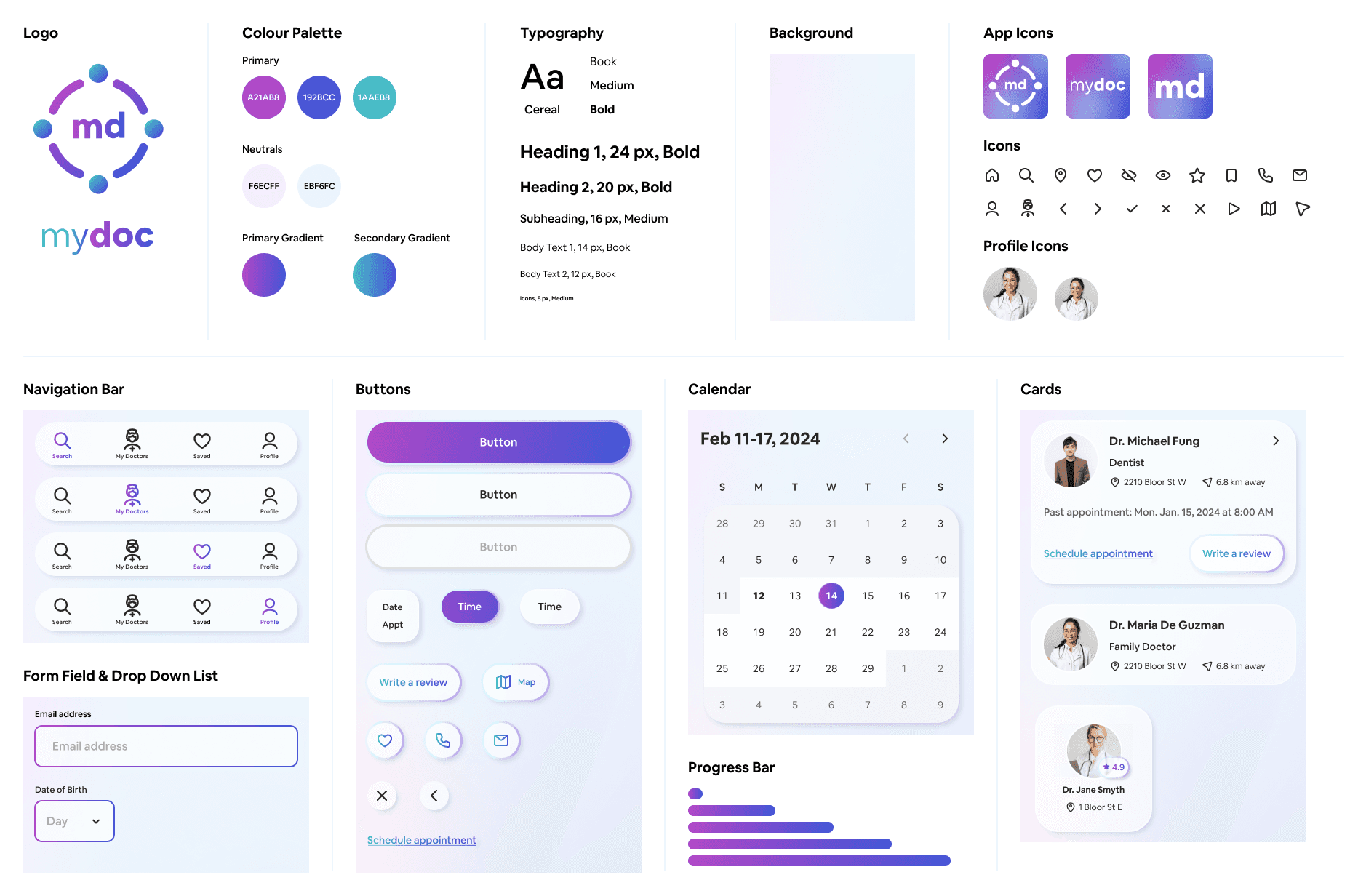
Catering to a younger, tech-savvy demographic of Gen Z and Millennials, this modern sleek aesthetic moves away from the traditional flat UI commonly found in medical apps. The cool toned gradients aim to convey a sense of comfort, innovation, and trust that is reflective of modern medical advancements.
The logo is a simplified depiction of a top down view looking at people in a circle with arms outstretched linking together.
It aims to convey the function of the app to match patients to doctors, and also to represent trust, empathy, inclusion, diversity, and community.
The first iteration of the high-fidelity wireframes was created with the feedback received from the initial round of usability testing, along with the added branding.
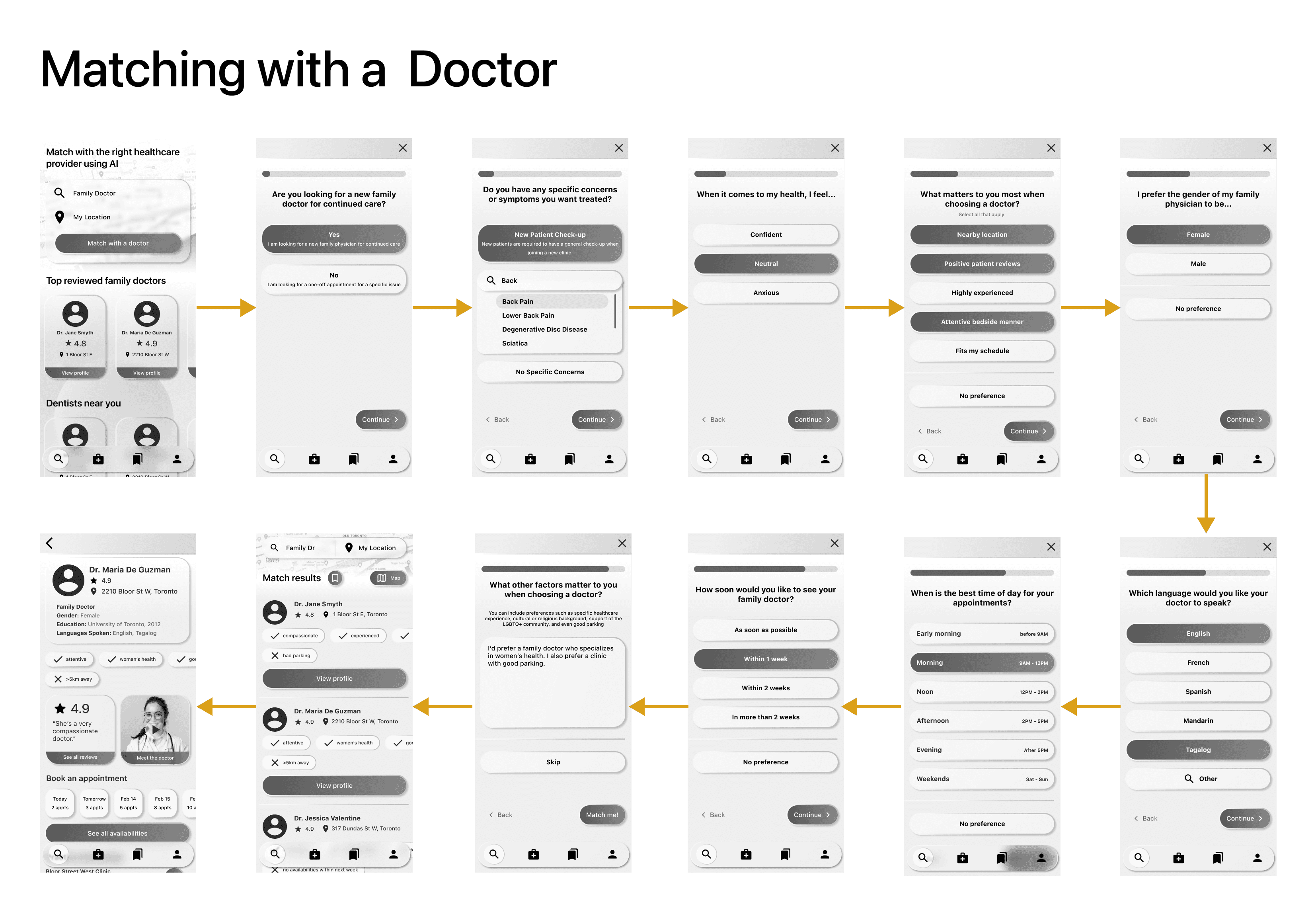
Matching with a doctor
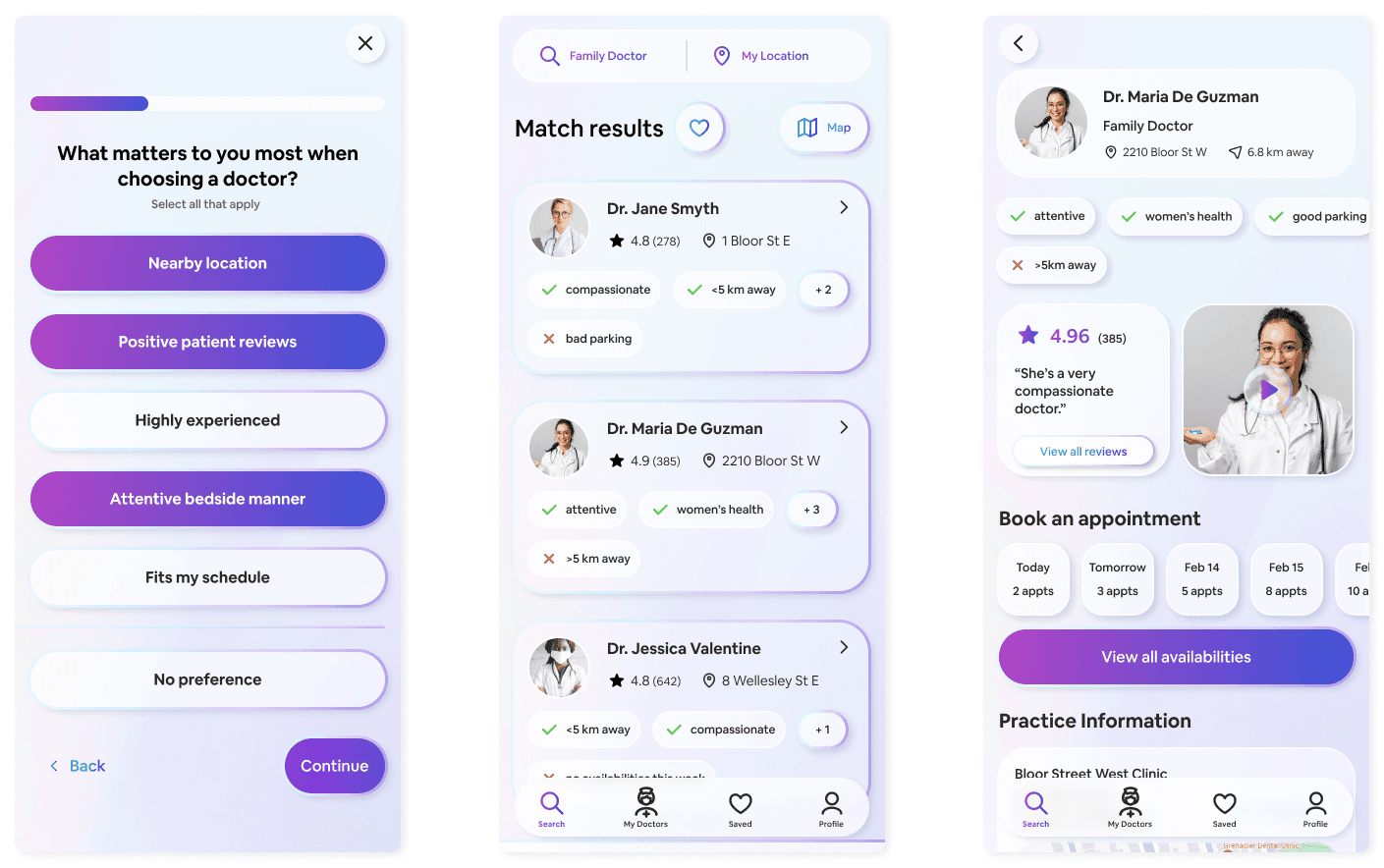
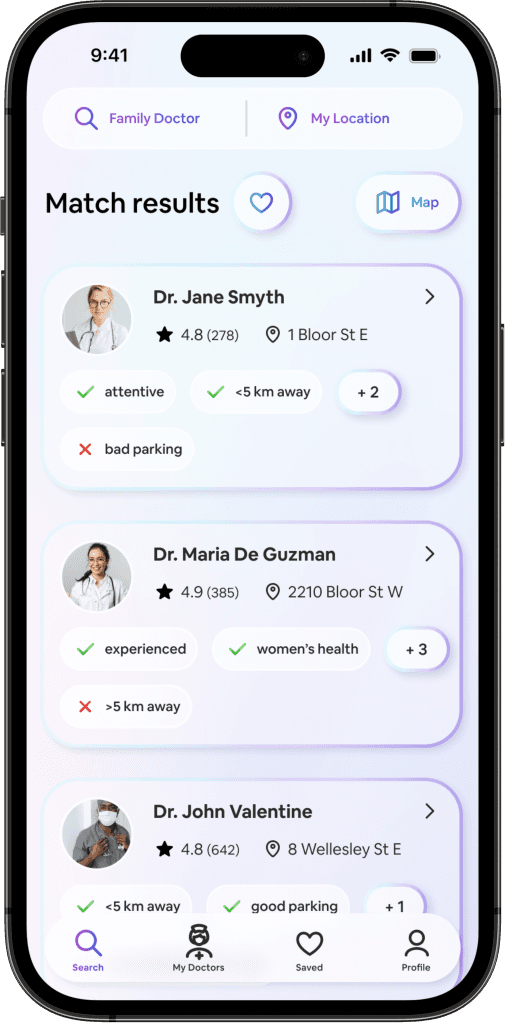
The match results show suitable doctors and personalized tags with their pros and cons, which were generated based on the user's assessment. This allows for quicker decision-making.
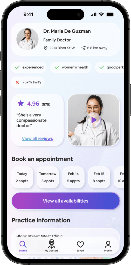
The doctor's profile prioritizes the doctors qualities "above the fold". For example it displays the tags, their reviews, and a video of the doctor that the users can play to begin building rapport.
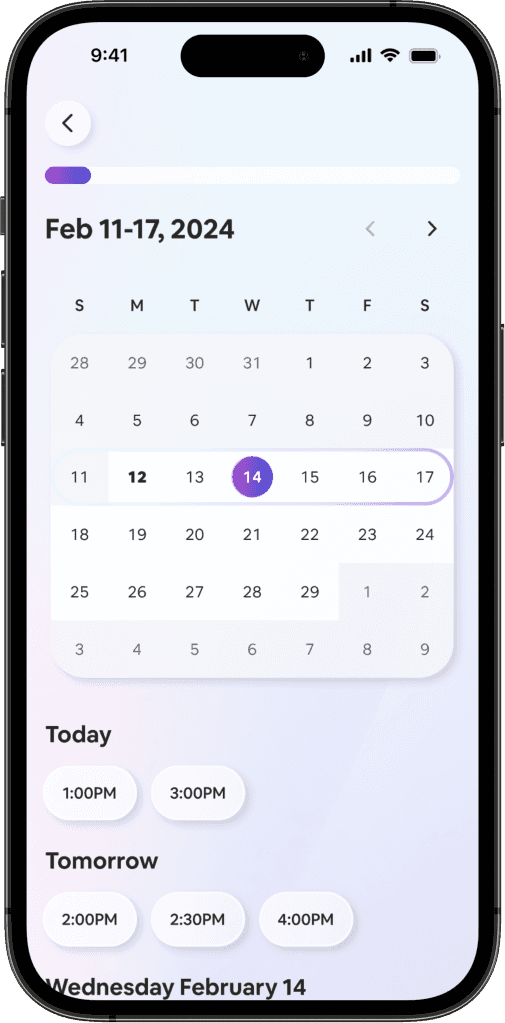
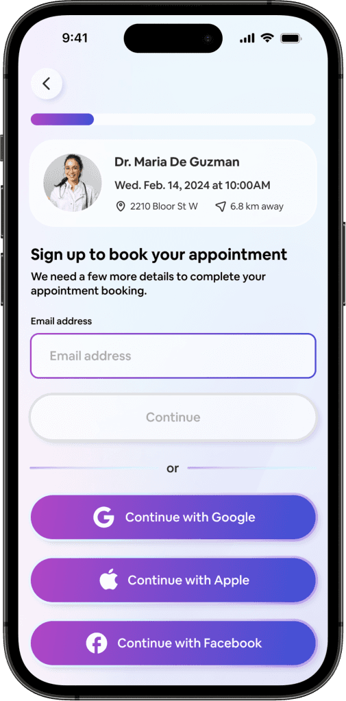
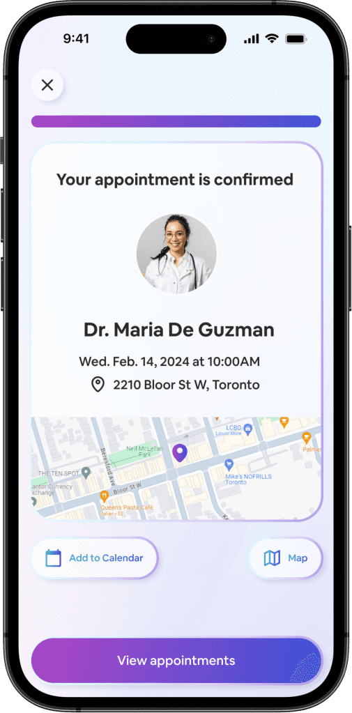
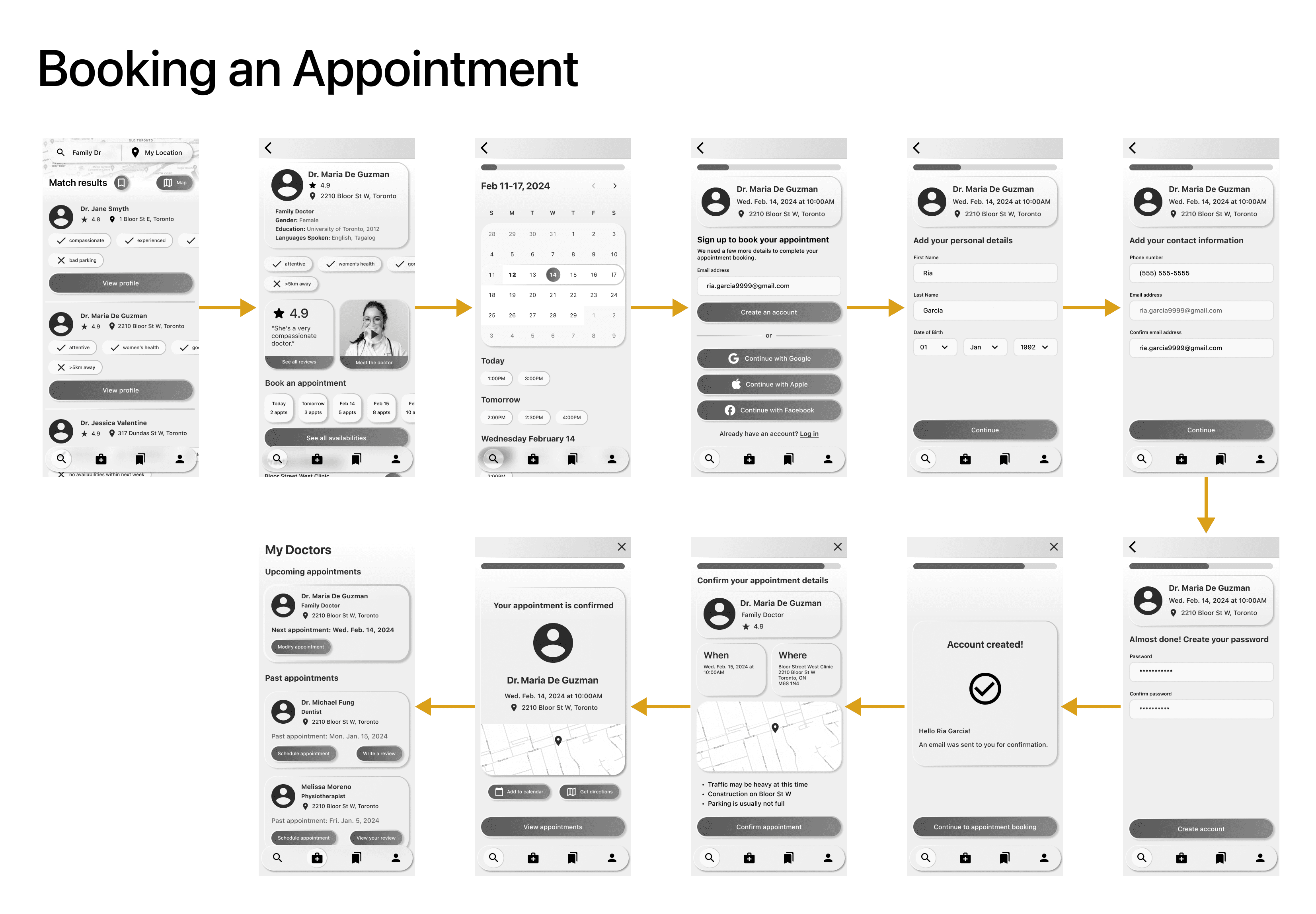
Booking an appointment
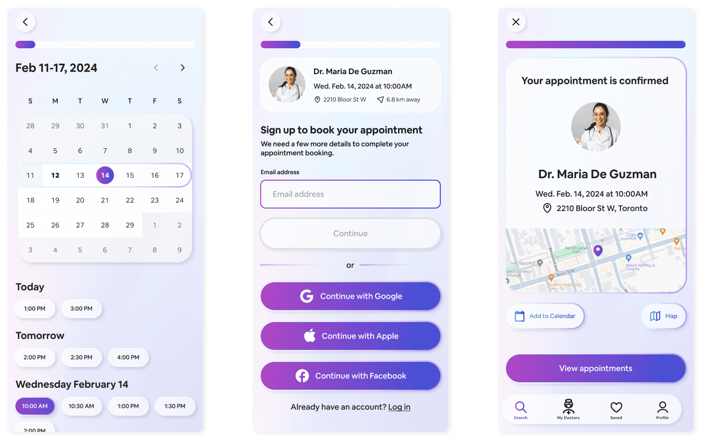
The booking system borrows from existing design patterns such as Zocdoc, where signing up or logging in isn't required to match with a doctor until the user books an appointment. This reduces the barrier of entry.
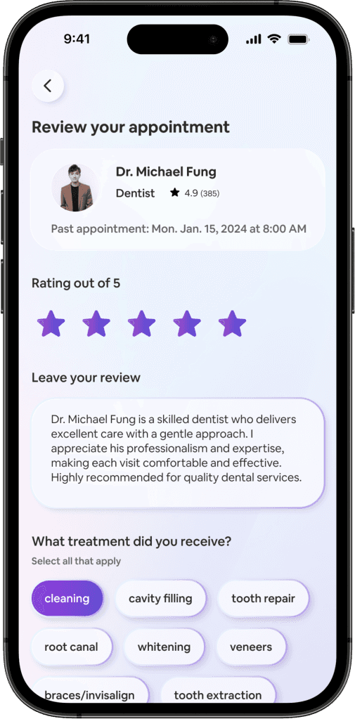
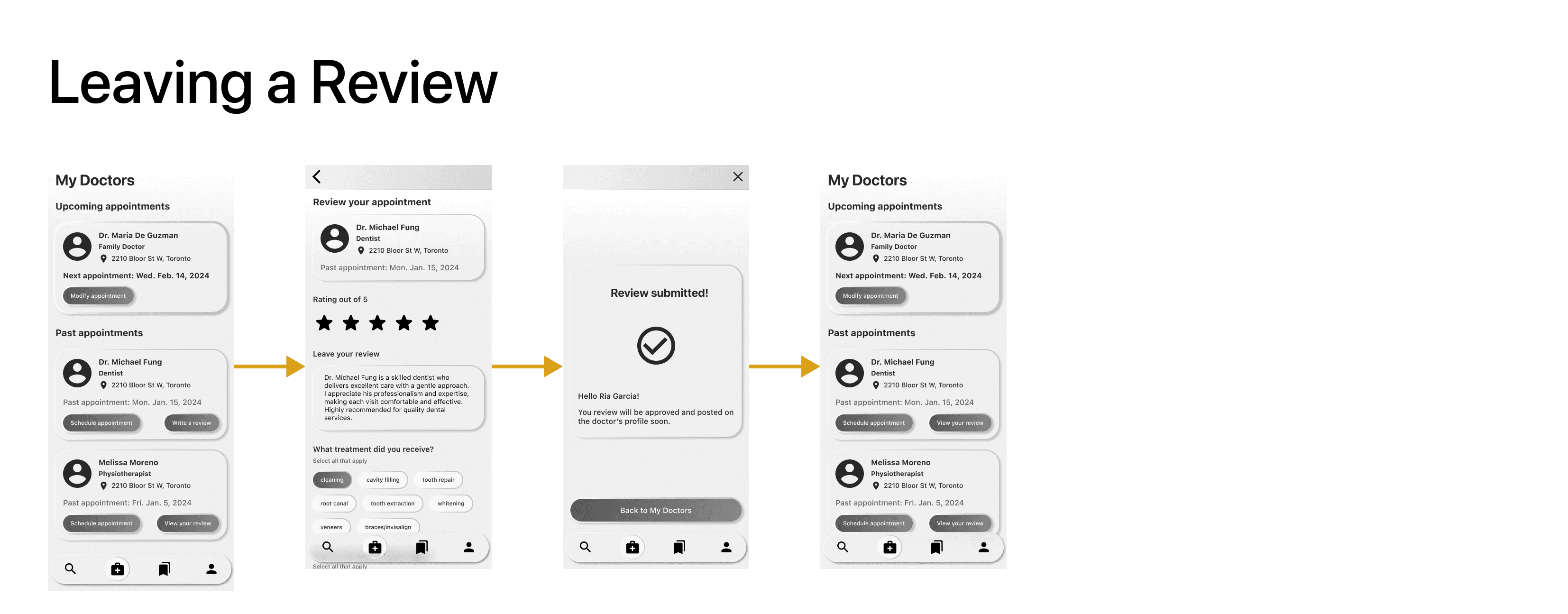
Leaving a review
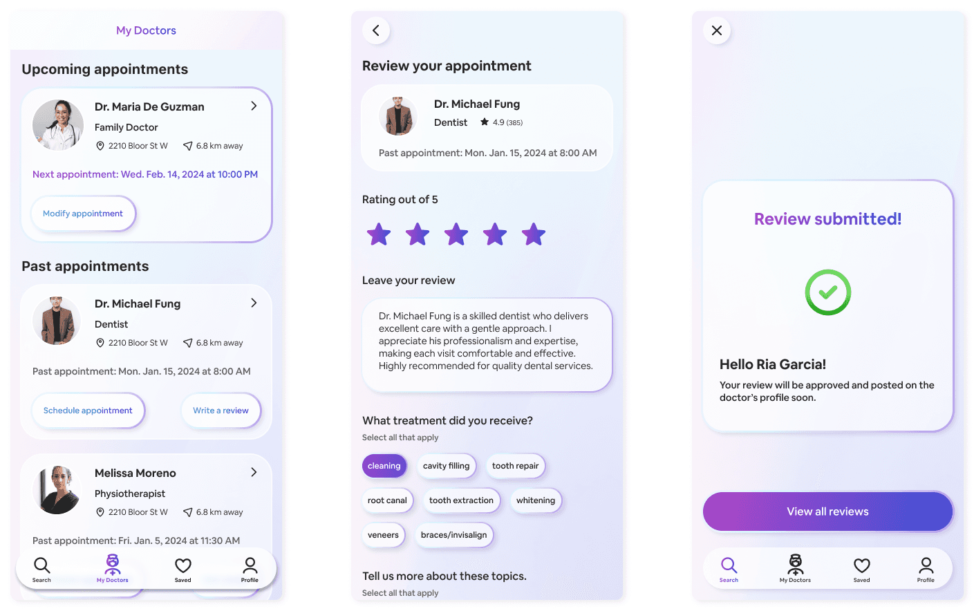
The review system borrows from Google Reviews due to its familiarity to users. Additionally it allows the user to review as little or as in-depth as they want.
I created a UI kit for mydoc as a guide for future iterations and more features.
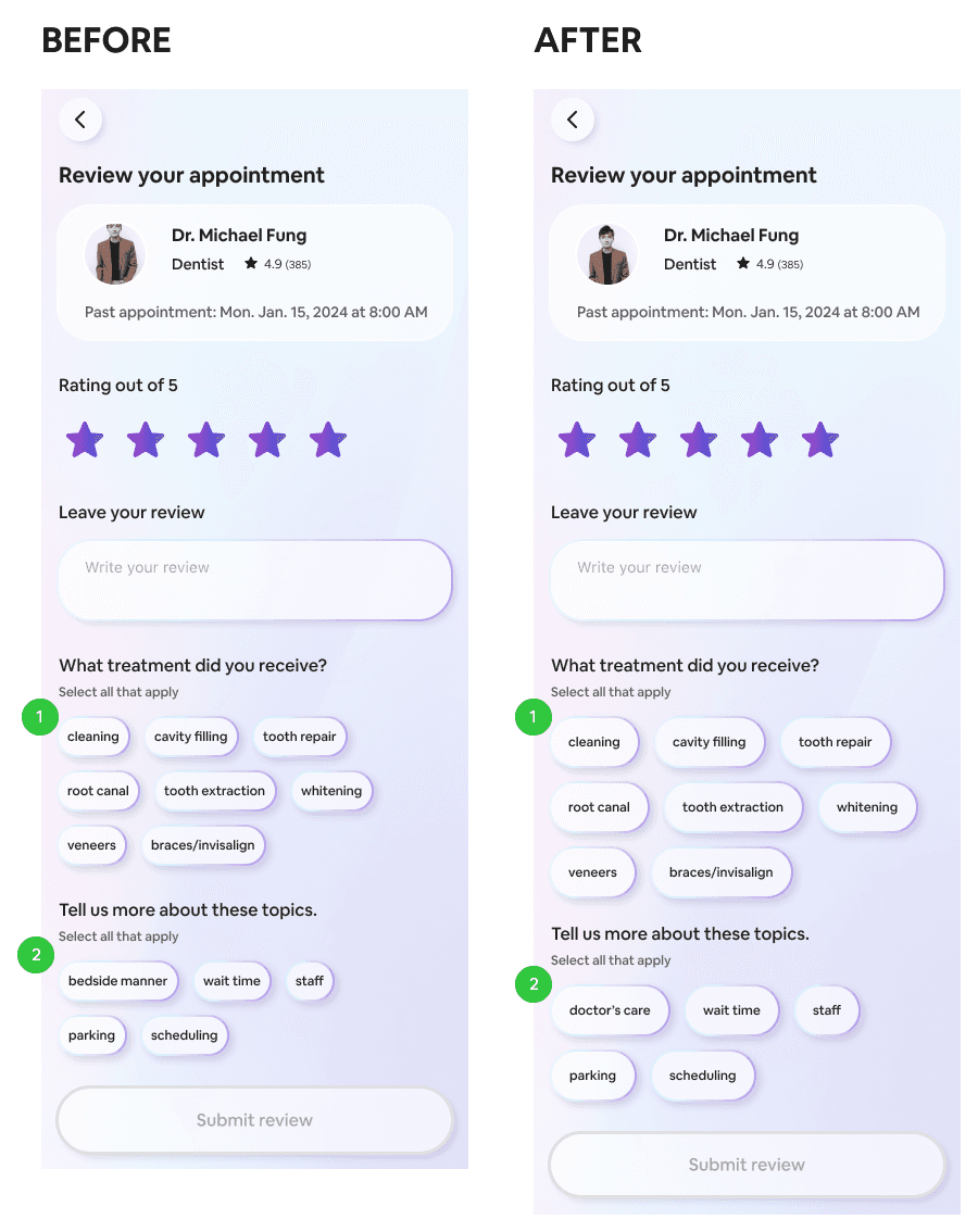
Based on usability testing, these small tag buttons were being missed when tapped, so the button size and padding in between them was increased in order to increase tap accuracy.
When I asked participants what they thought “bedside manner” meant only 2 out of 5 correctly answered. I’ve decided to change this medical jargon to “doctor’s care” which is more self-explanatory.
This phrase would need to be tested further for understanding in future usability tests.
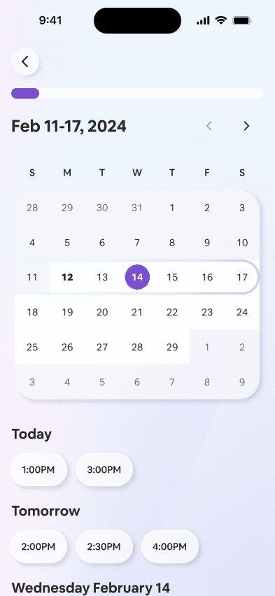
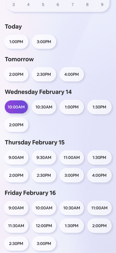
To create a more responsive date and time selection I added a “scroll to” interaction when the date is selected so that it brings the user directly to the appointments available on that specific date.
This change was made based on the feedback from participants who double-tapped the date expecting a response.
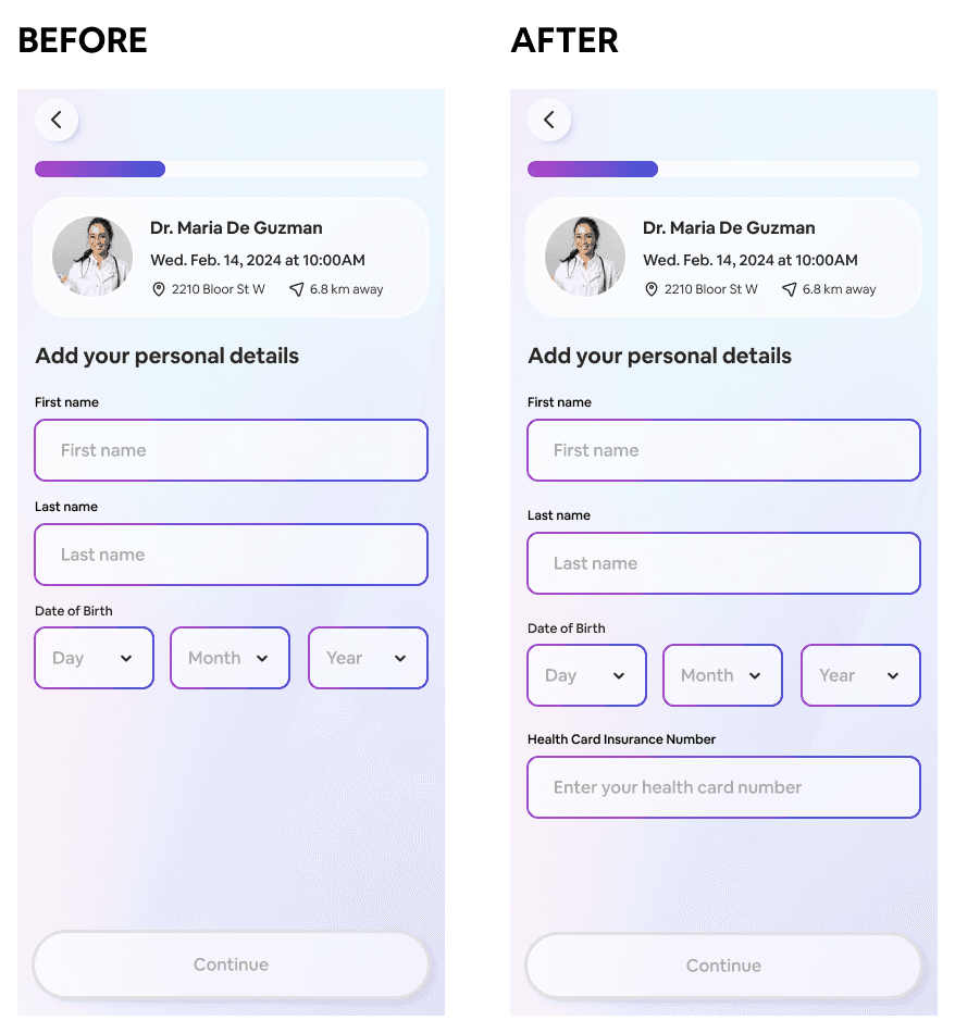
When asked what they expect to complete during account creation, 3 out of 5 participants said they expected to add their health card insurance number, so this was added. The health card number would help facilitate the processing of the user’s file at doctor’s clinics.
The process of finding the right doctor is a time-consuming and difficult process.
By taking a short assessment, the AI creates suitable matches to local doctors.
Ensure that text and elements are large enough to be pressed, and add responsiveness in interactions to provide the users with immediate feedback
Further refine the assessment questions on a larger population of participants to identify the most relevant questions that produce better doctor matches
A/B testing for design variations such as moving the appointment booking section on the doctor’s profile higher versus its current lower location
Continue user interviews after launch to examine the impact mydoc has on patients’ experience with their doctors, and even their health outcomes
Gather data on the effectiveness of mydoc on doctors’ business such as increased appointments, new patient registrations, and reduced workload for clinic receptionists.